Parking Data and Analytics: Turning Parking Activity Into Insight

Every parking operation generates data continuously. Permits are issued, vehicles are scanned, violations are recorded, payments are processed, and parkers move through lots and zones throughout the day. All of that activity is information — about how parking is being used, where demand is concentrated, how compliance is trending, and whether revenue is performing as expected.
The challenge isn’t collecting that data. Modern parking management systems capture it automatically. The challenge is turning it into something you can actually act on — and doing that consistently enough that decisions are made based on what’s really happening rather than what someone thinks is happening.
This page covers what parking data and analytics actually includes, the specific questions it can answer, the KPIs that matter most in practice, and what it looks like when analytics drives real operational and strategic decisions.
What parking data and analytics actually includes
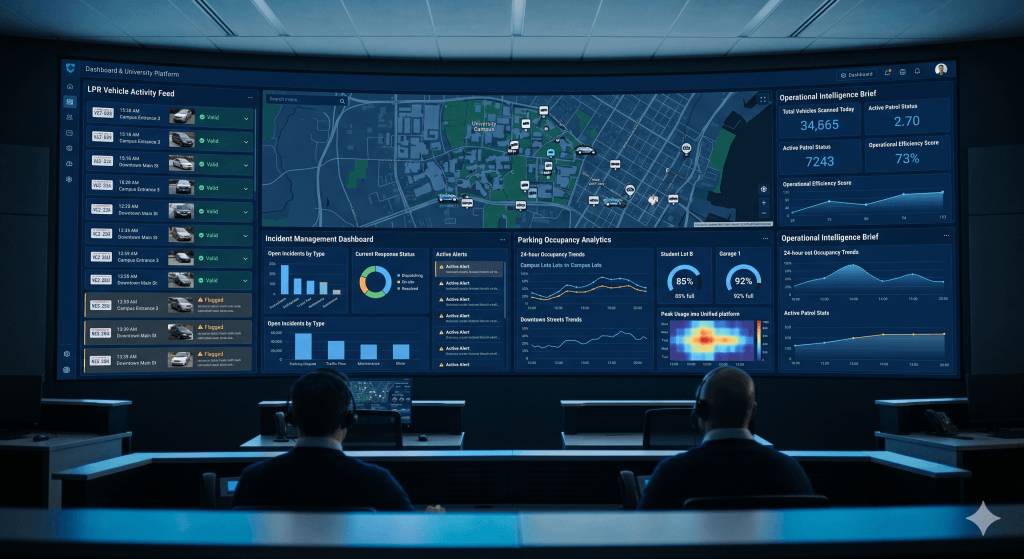
Parking analytics isn’t a single report or dashboard. It’s the continuous capture, connection, and interpretation of data across the full parking operation. In a connected system, that means data flowing from four core sources:
- Permit and access data. Who has a permit, where they’re authorized to park, when permits were issued and renewed, how many permits exist per zone, and how waitlists are moving. This data tells you about demand — how many people want to park in each location and what the gap is between supply and authorized access.
- Enforcement activity. Vehicle observations, digital chalking records, violations issued, patrol coverage patterns, and dwell time data. This tells you about actual parking behavior — where people are parking, for how long, and whether they’re complying with the rules.
- Payment and revenue data. Permit revenue by zone and category, violation payment rates, outstanding balances, appeal outcomes, and revenue trends over time. This tells you whether the financial model is working and where collections are falling short.
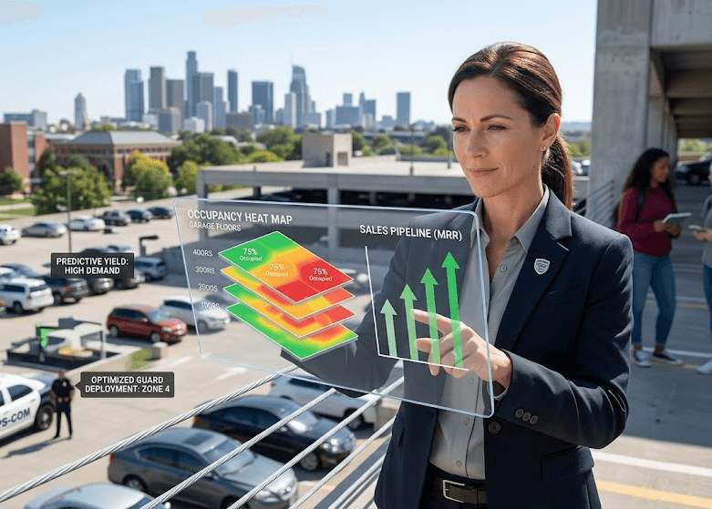
- Occupancy and utilization. How full each lot or zone is at different times of day, on different days of the week, and across different seasons. This is the data that informs supply decisions — whether you have too much parking in one place and not enough in another, and whether existing capacity is being used efficiently.
When these four streams come from separate systems, they produce conflicting numbers, delayed reports, and reconciliation headaches. When they come from a single connected platform, they produce a consistent, real-time picture of the operation.
The KPIs that actually matter in parking operations
A lot of parking analytics discussions stay at the level of “measure compliance rates and revenue trends.” That’s not wrong, but it’s not specific enough to be useful. Here are the metrics that parking managers and directors actually track — and what each one tells you about the health of the operation.
Violation collection rate
The percentage of issued violations that are actually paid. This is one of the most direct indicators of enforcement effectiveness — not just whether violations are being issued, but whether the system behind them is producing real outcomes. The Town of Perth achieved a 91% collection rate in Year 1 after implementing connected enforcement and online payment workflows through OPSCOM. That number reflects both the quality of enforcement and the ease of the payment process — when paying is easy and the evidence is strong, most parkers simply pay. Read the Town of Perth case study.
Permit utilization rate
The percentage of issued permits that are actively used. A lot with 200 permits issued but only 140 vehicles regularly present has a utilization problem — revenue is being collected for access that isn’t being used, but the lot may still be perceived as full by people who want to park there. Utilization data informs decisions about permit allocation, waitlist management, and whether zone boundaries need adjustment.
Occupancy by time and location
Average and peak occupancy for each lot or zone, broken down by time of day and day of week. This is the data that tells you where demand is concentrated and when. A lot that’s consistently at 95% capacity on Tuesday mornings but 40% on Friday afternoons has a turnover problem or a pricing opportunity, depending on the context. Occupancy data is also what justifies infrastructure decisions — like expanding a parking structure.
A large US healthcare organization — an OPSCOM client — used utilization and demand data from OPSCOM registrations to inform the decision to expand one of their campus parking garages. As their Executive Director of Facilities put it: “A recent expansion of one of our campus’ parking garages was informed by utilization and demand data that comes from OperationsCommander registrations.” That’s a capital infrastructure decision made with confidence because the data was reliable. That’s what analytics is actually for.
Compliance rate by zone
The percentage of vehicles observed in each zone that are compliant with the applicable rules — valid permit, within time limits, correct zone. Compliance rate by zone tells you where enforcement attention is most needed and whether enforcement activity is actually changing behavior. A zone with 15% non-compliance after six months of regular enforcement has a different problem than a zone that started at 15% and is now at 5%.
Repeat offender rate
The percentage of violations issued to vehicles with prior violations. High repeat offender rates indicate that enforcement isn’t changing behavior — either because consequences aren’t escalating, because payment is too easy to avoid, or because the same vehicles keep testing the system. Tracking repeat offenders by plate is one of the core capabilities that Brandon University was missing before implementing OPSCOM — and it was contributing directly to their unexplained revenue decline. Read the Brandon University case study.
Appeal success rate
The percentage of appealed violations that are overturned. A high appeal success rate is a signal about evidence quality — violations are being successfully disputed because the supporting documentation isn’t strong enough to uphold them. Tracking this metric over time, and correlating it with changes in enforcement workflows, tells you whether evidence quality is improving.
Revenue per permit category
Revenue broken down by permit type — student, faculty, staff, visitor, temporary, monthly. This tells you which categories are performing as expected and which aren’t, and informs pricing decisions for renewals and new allocations. For operations that cross-subsidize visitor parking with permit revenue, or that rely on violation income to offset operational costs, category-level revenue tracking is essential.
Patrol coverage efficiency
How much of the parking inventory is being observed during each patrol cycle — and how that coverage relates to violation rates. If a patrol covers 80% of lots but violations are concentrated in the 20% that gets less attention, that’s an actionable insight about coverage allocation. LPR-enabled patrols make this metric particularly useful because plate reads are logged automatically, giving a precise record of what was observed and when.
Analytics in practice — the decisions it enables
Abstract descriptions of analytics capabilities are less useful than specific examples of the decisions data makes possible. Here’s what parking analytics actually looks like when it’s working.
Adjusting time limits based on actual turnover data
A municipality has implemented two-hour free parking downtown to support local business. After six months of digital chalking data, the analytics show that most vehicles in the core shopping blocks leave within 90 minutes — but in the block nearest the transit stop, average dwell time is 3.5 hours and the violation rate is high. The data suggests the time limit may need to be shorter on that block, or enforcement may need to be more frequent. Without the dwell time data, that insight isn’t visible. With it, it’s a straightforward policy conversation supported by evidence.
Identifying permit waitlist pressure before it becomes a problem
A university’s faculty parking waitlist has grown by 35% over the past academic year, while utilization data shows that a nearby staff lot is averaging 68% occupancy throughout the day. The data suggests there’s available capacity that could be reallocated — reducing waitlist pressure without building new infrastructure. This kind of cross-referencing between waitlist data and utilization data is only possible when both datasets live in the same system.
Building the case for infrastructure investment
A healthcare campus is considering expanding a parking structure. Before committing to the capital cost, leadership wants to understand current utilization patterns. OPSCOM’s occupancy data shows the existing structure is consistently above 90% capacity between 8am and 2pm on weekdays — but only 55% full in the evenings and on weekends. The data supports a targeted expansion and informs the design: additional capacity focused on daytime clinical parking, not general expansion. The decision is made with confidence rather than based on perception.
Diagnosing a revenue decline
Brandon University experienced an unexplained year-over-year revenue decline before implementing OPSCOM. Without connected analytics, the cause was invisible — the existing system couldn’t show where revenue was being lost, whether violation collection rates had dropped, or whether repeat offenders were gaming the system. After implementing OPSCOM, the analytics made the situation legible and addressable. Read the full Brandon University case study.
Optimizing patrol coverage
Enforcement data shows that violation rates are highest between 10am and 1pm in two specific zones — but current patrol scheduling allocates equal coverage across all zones throughout the shift. Reallocating patrol time to concentrate coverage in the high-violation windows reduces violations more efficiently without adding staff. That reallocation is only possible when the data shows clearly where and when violations are occurring.
Why data quality depends on system architecture
This point deserves emphasis because it’s often discovered too late: the quality of your analytics is a direct function of how your data is structured at the source.
When permits are managed in one system, enforcement in another, and payments in a third, each system produces its own reports — with its own data definitions, its own timestamps, and its own reconciliation logic. When you try to answer a question that crosses those systems — “what’s the collection rate on violations issued to vehicles with expired permits?” — you’re pulling from three different data sources and hoping they agree. They usually don’t, completely.
In a unified platform, every action — permit issuance, plate read, chalking observation, violation, payment, appeal — writes to the same database with the same timestamp and the same vehicle record. A question that crosses operational areas can be answered in one query rather than three manual exports. And the answer is reliable because there’s only one version of the data.
This is why OPSCOM’s single-database architecture matters for analytics specifically — not just for operational efficiency. The unified platform approach produces analytics that administrators actually trust, rather than reports they have to sanity-check against other sources before they’ll act on them.
Analytics and strategic reporting
Beyond day-to-day operational decisions, parking analytics serves a strategic reporting function — giving parking directors, facility managers, and senior leadership the data they need to make policy decisions, justify budgets, and demonstrate operational value.
The reports that matter most at the strategic level:
- Annual revenue reports broken down by permit category, violation income, and payment channel — showing how parking contributes financially to the organization
- Compliance trend reports showing whether enforcement is producing measurable behavior change over time
- Utilization reports by lot and zone — supporting decisions about permit allocation, pricing, and infrastructure
- Enforcement activity summaries showing patrol coverage, violation rates, and officer productivity
- Appeal outcome reports showing dispute rates and resolution patterns — a proxy for evidence quality and enforcement consistency
When these reports are generated from a single connected system, they can be produced on demand rather than compiled manually. Carleton University’s Director of Campus Safety, Brian Billings, specifically cited the ability to access the system from anywhere — office, home, or travel — as a key operational advantage. That accessibility is only possible when all the data lives in one place. Read the Carleton University case study.
Explore parking data and analytics in depth
- Parking data and analytics: connecting operational activity into real-time insight
- Parking operational analytics: the KPIs that measure what’s actually happening
- Data-driven revenue strategy: how analytics improves parking financial performance
- Occupancy and demand analytics: understanding how parking is actually used
- Parking reporting and insights: turning data into decisions
- Unified parking and security data: how connected operations improve situational awareness
Want to see what parking analytics looks like in a live connected system?